Kafkai V4 - From Website Audit to Production Launch
From website audit to production launch, I led the full overhaul of Kafkai, covering strategy, copywriting, design direction, frontend build, and CMS migration.
Tech Stack
1 The Challenge
The Kafkai website had a positioning problem, vague messaging, split CTAs, and a cluttered dev experience that made it hard to communicate value and convert visitors.
2 The Solution
Led a full repositioning to 'Competitive Intelligence Platform', grounded in persona pain point research and high-converting web structure analysis, then rewrote all copy to match.
Kafkai V4 - From Website Audit to Production Launch
How I took Kafkai from a website with broken positioning and a painful dev experience to a fully rebuilt, live site, through audit, strategy, copywriting, design direction, and implementation.
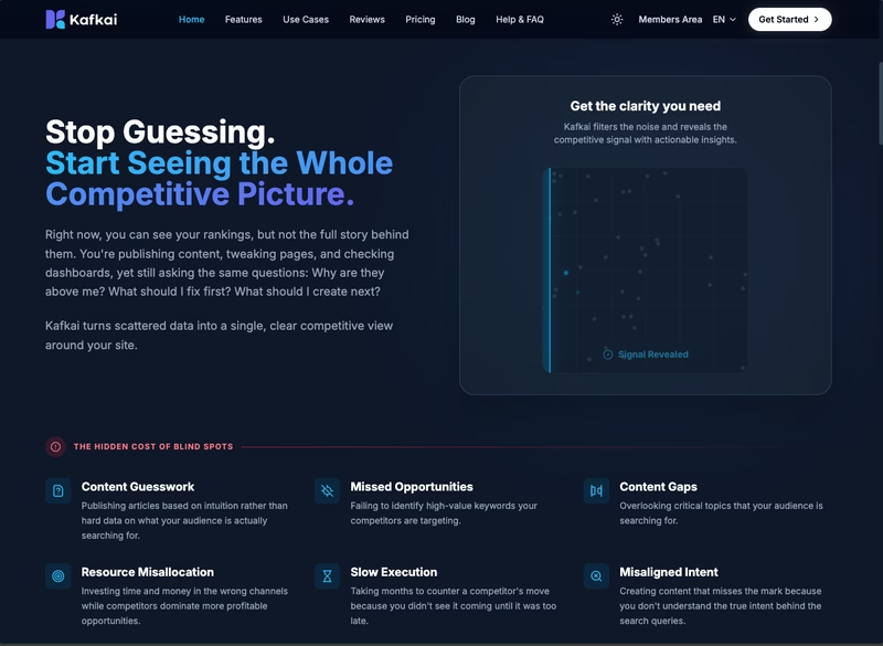
Before Update
This is how the website looked before the V4 overhaul.
Why It Needed to Change
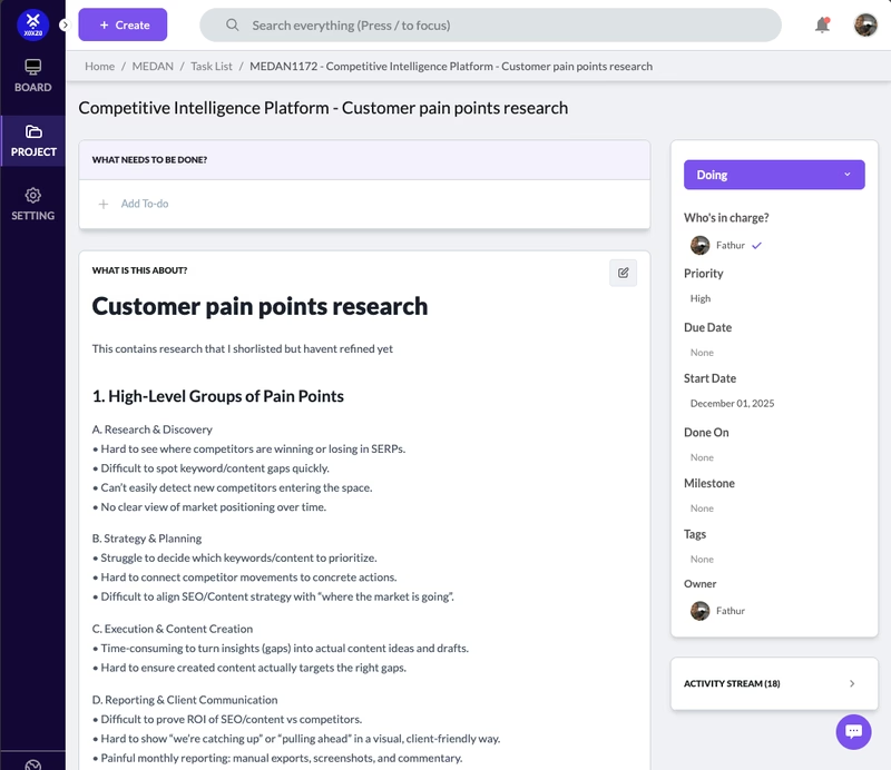
Researched the Problem Space
Before making any decisions, I dug into what was actually going wrong. I looked at where users were dropping off, what the existing messaging was promising versus what the product could deliver, and how competitors were positioning themselves. This grounded every decision that followed in evidence rather than assumptions.
I audited the existing website and presented the findings to the team in a slide deck, backed by site analytics and user behavior patterns, that laid out three core problems:
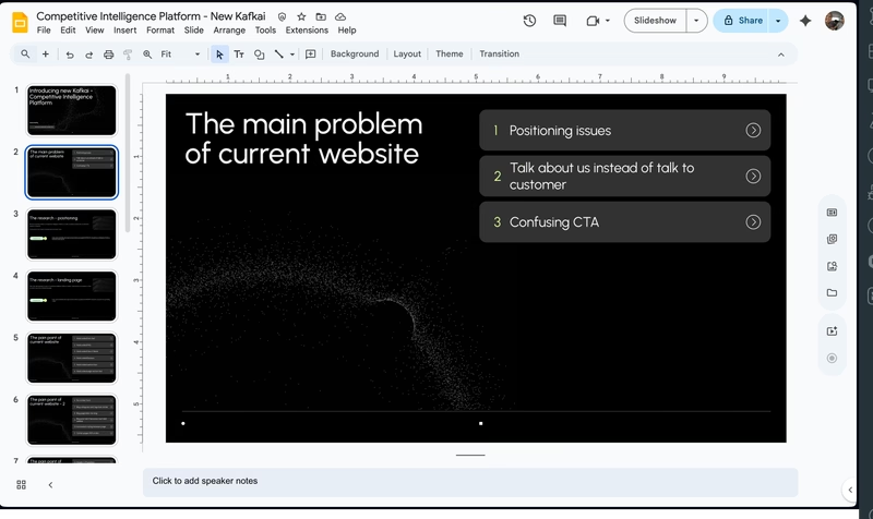
1. Positioning Problem
The site was trying to be everything to everyone. "AI content writer" is a crowded, commoditized category. Visitors couldn't tell why Kafkai was different, or who it was actually for.
2. Copy Problem
The existing copy was written from the product's perspective, leading with features and capabilities instead of what users actually felt. Headlines described what Kafkai does, not the frustration of watching competitors outrank you despite producing worse content. Visitors were never given a reason to care before being asked to act.
3. CTA Problem
The site had multiple CTAs competing for attention, splitting focus between free tools and sign-up. Instead of guiding visitors toward one clear action, the page gave them options, and most picked none.
On top of that, the primary "Get Started" button sent visitors straight to the pricing page before they'd seen enough to care. Landing on pricing before understanding the value is a reliable way to lose someone, and that's exactly what was happening.
4. Developer Experience Problem
The website was built inside a Django codebase that also handled multi-language support. Managing translations across multiple languages was tedious and time-consuming, pulling developer focus away from product work. Every marketing content update, no matter how small, required a developer to get involved. A single copy change on one page could eat up hours of dev time that should have gone toward building features.
What I Did
Once we aligned on the problems, I led the work to fix them.
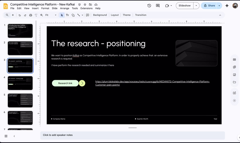
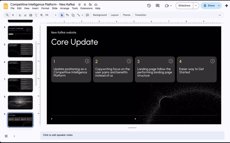
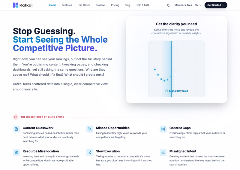
1. Decided on a New Positioning
After workshop discussions with the team, we landed on a clear positioning: Competitive Intelligence Platform. Instead of "write content with AI", the new story was "outrank your competitors by understanding what they're ranking for." This repositioned Kafkai in a less crowded space and spoke to a more outcome-driven user.
2. Researched Persona Pain Points
I dug into the target persona, SEO specialists and content marketers, to understand their daily frustrations. Key pain points emerged:
- Spending hours manually checking competitor rankings
- Not knowing which keywords to prioritize
- Publishing content that never gains traction because it's based on guesswork
These pain points became the foundation for every headline and section.
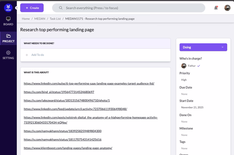
3. Researched Highly Converting Web Structures
I studied SaaS websites with strong conversion patterns to understand what structural elements and copywriting frameworks work, problem-agitation-solution framing, social proof placement, benefit-led headlines over feature-led ones.
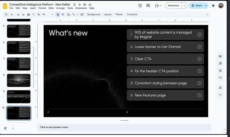
4. Presenting the new direction
With the research done and the positioning decided, I put together a presentation for the team laying out exactly what was changing and why. This wasn't just a design handoff — it covered the new story, the structural changes to the site, and how each decision tied back to a specific problem we'd identified. Getting everyone aligned before touching a single pixel meant fewer surprises later and faster sign-off on execution.
5. Fixed the Conversion Flow
To solve the CTA problem, I changed the conversion path entirely. Every "Get Started" button now leads users directly to the register page, skipping the pricing page that was causing drop-offs. Visitors who aren't ready to pay don't get confronted with a price before they've seen the value.
I also redesigned the hero CTA to be more interactive and intent-driven. Instead of a generic button, users are invited to enter their domain and submit. That action takes them straight into the register page, making the first step feel like the product has already started working for them.
6. Rewrote the Copy
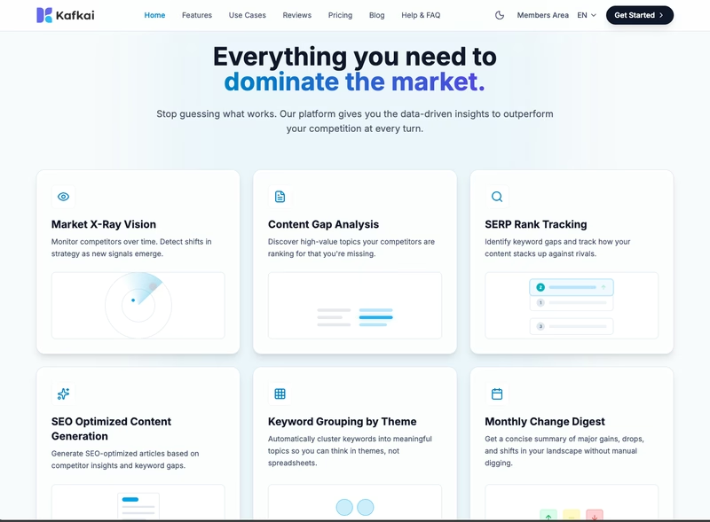
With the new positioning and user pain points in hand, I rewrote the website copy from top to bottom, hero section, features, pricing, and CTAs, to reflect what Kafkai actually does for users: help them win on search by knowing their competition better than anyone.
7. Directed the Design
With the copy and structure defined, I directed a designer to bring the vision to life. I provided clear references, layout intent, and section-by-section briefs, reviewing iterations and giving precise feedback until the visual execution matched what I had in mind for each page.
8. Built the Frontend
Once the design was approved, I implemented the frontend using TailwindCSS, Django and AlpineJS, translating the designs into clean, responsive code that matched the approved specs.
9. Integrated with Wagtail CMS
To fix the developer experience problem at its root, I integrated the new site with Wagtail CMS. This gave the team a proper content management layer, non-developers could update copy, swap images, and manage pages without touching code. No more slowdowns from simple content changes.
10. Migrated Content to Wagtail
After the integration, I performed a full content migration, moving existing pages, blog posts, and marketing content into the new Wagtail structure so the team could hit the ground running on launch day.
The Result
The new site launched with a clear story: Kafkai helps you outrank competitors, not just write content. Visitors now land on a page that speaks to their actual problem before asking anything of them. The team has a sharper way to talk about the product, and the site finally reflects what Kafkai is actually good at.
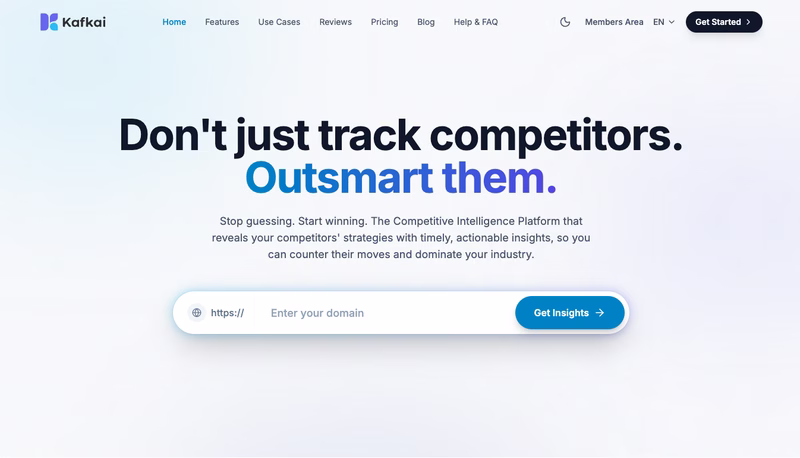
This project was one of the most end-to-end things I've done, touching research, strategy, copywriting, design direction, frontend implementation, and CMS integration all in one engagement. The result speaks for itself. See the live site at kafkai.com.